

Problems and current situation
When I first joined SmartX, the design team had only 5 people, and there were many shortcomings in the component design documentation of the internal design system CloudTower UI, specifically:
Some components of CloudTower UI 1.05 are outdated and cannot correspond to CloudTower UI 1.1.
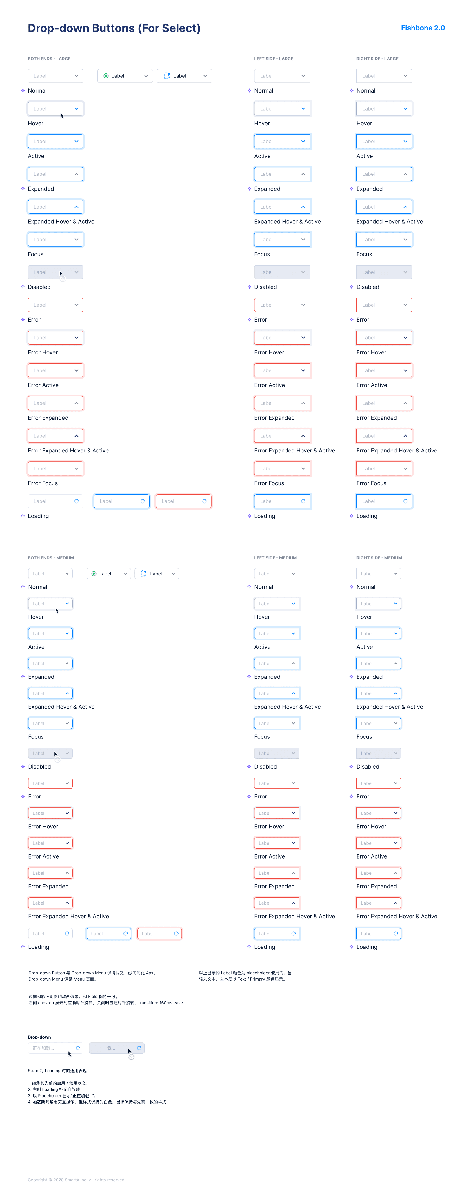
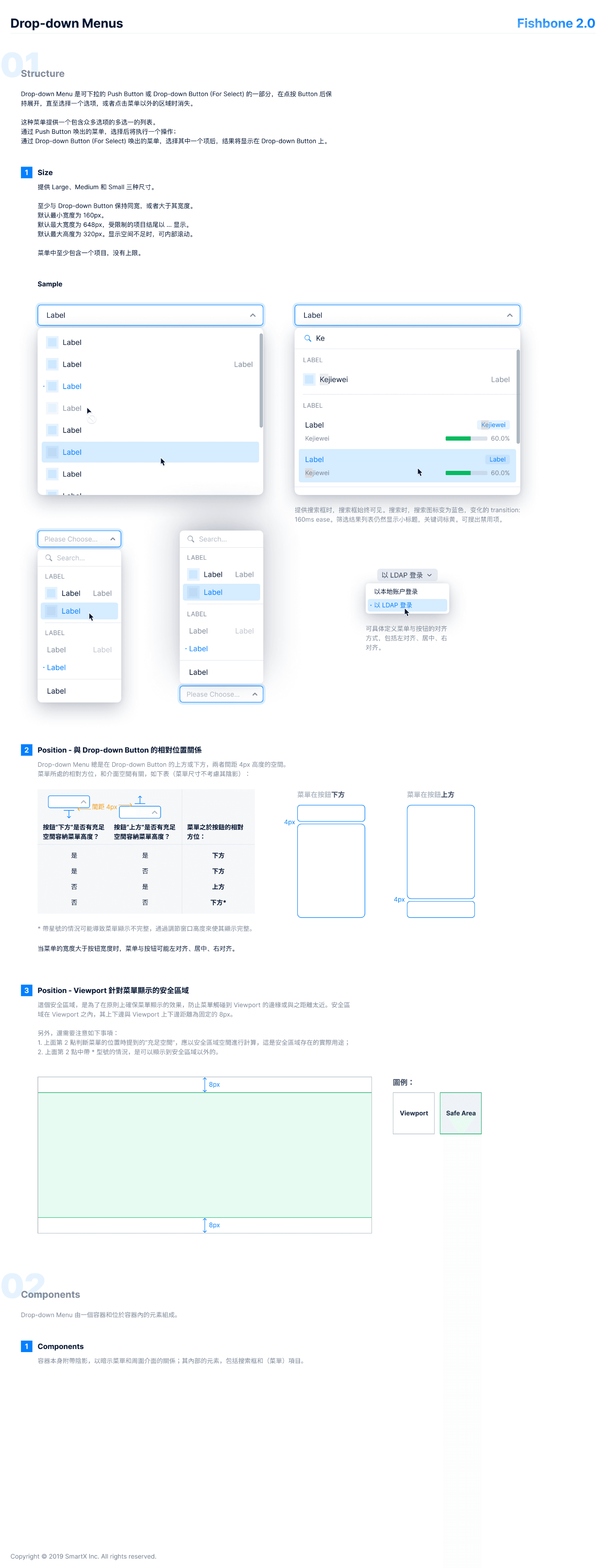
CloudTower UI 1.1 only includes Figma components, lacking the behavioral descriptions needed for component development, such as hover states, visual parameters, scenario usage guidelines, necessary interaction instructions, etc.
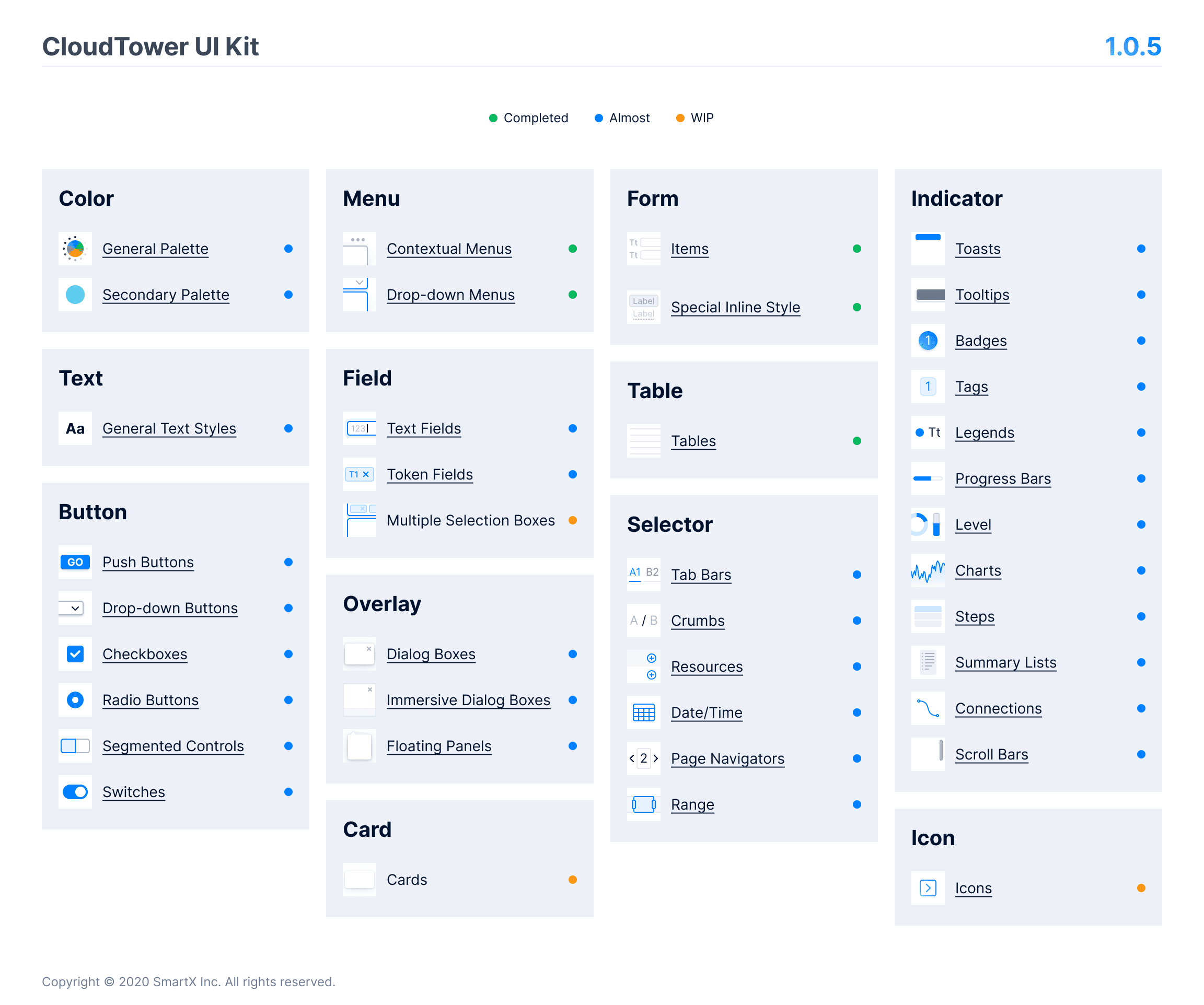
CloudTower UI 1.0.5 Some components are outdated and the design explanation is not comprehensive enough.

CloudTower UI 1.0.5 part component description document overview.

CloudTower UI 1.1 provides only available components for designers, lacking corresponding design instructions.
In addition, given that CloudTower has entered the 3.x version cycle, many components need to be further optimized and upgraded or added variations according to new business requirements and scenarios in order to better fit the actual business scenario needs. For example:
Tag adds Split styles and Hover states
Some components need to add loading style instructions
The disabled styles of some input controls are not unified, or need design optimization
The Accordian component needs to add expand/collapse icons
Tooltip, Popover, Card lack standardized component definitions
…
On the external side, within the CloudTower 3.5 cycle, the Tower development team had a UI Kit project (Eagle) and dedicated manpower to align and complete the development of components.
In conclusion, the refinement driving force of this design system mainly comes from the following three aspects:
Design aspect: the components are outdated, some components cannot meet the requirements of new functional scenarios, some component types are missing, and the design documentation for the components is incomplete.
Development aspect: the online component restoration is not ideal, and the project inspection is time-consuming and laborious. There has been no dedicated resource input for the long-term development and maintenance of the front-end component library.
Timing pace: by the CloudTower 3.x cycle, most designers within the team have accumulated some business components or variants, which need to be further distilled into design documentation and delivered to front-end development. Otherwise, different development personnel will need to re-implement them in different projects, wasting development manpower.
Taking into account the above reasons, the design team has identified the task and goal of perfecting the design system document within a 3.5-week period. The new version of the design system has been renamed CloudTower UI 1.5.
Design objectives
The design goal of CloudTower UI 1.5 DS is to prioritize the improvement of component documentation based on the design system plan. The design delivery will focus on component descriptions without business logic as the core, while organizing Design Patterns and UI Map, ultimately establishing a comprehensive design guide.

Design System Perfect Schedule.
Optimized component design process
The component design process includes the entire process from component decomposition to component implementation and inspection.
Component documentation drafting structure
Because the Design Manager would like us to explore our individual document writing and visual styles, the writing of component documents is not subject to strict and detailed writing standards, but generally follows the following 6 major structures:
Example
Component examples in real business scenarios
Element composition
The smallest atoms that make up a component, understand the component composition
Summary of types
Display of all types of components
Interaction Description
Explanation of key interaction details of the component
visual parameters
Visual parameters of key parts not annotated by undeveloped engineers
Edge and unusual scenarios
Certain components will include style references such as empty state, error state, and more.
In actual writing, different components may omit or add specific modules based on different actual business requirements. Some simple components, such as Legend, Badge, Link, etc., usually omit the visual parameter part; more complex components, such as Resource Selector, Tree, Tabs, etc., will provide a Design template for designers to use directly and so on.
Design output results
The improvement work of the design system I am involved in mainly covers the Component, Pattern, and UI Map 3 parts. Below are some project cases:
⚛️
Component Document Example
Component design module. I am mainly responsible for optimizing navigation components, including Breadcrumb, Link, Pagination and other small projects. Because at the beginning of the project, higher priority business projects were carried out synchronously, so my involvement in these projects was not very extensive.
由于文件过大,完整内容请参考 Figma 链接🔗
Breadcrumb
Used to display the current page's position in the hierarchical structure and support upward navigation.
Using scenarios
Paired with other navigation components, used as auxiliary navigation.
Support single-level return.
Related Components
PageHeader
As a secondary navigation aid, convey the page hierarchy
Org-Name
Datacenter-Name
Resource-Name
Create
Label
Label
Label
Label
Label
Label
Virtual machine restore point
event
Hygon-centos7
fe-test
Windows-2019
cluster-name
cloudtower-test-cluster111111111111111111111111111111111cloudtower-test-cluster11111111111111111111111111
1111111cloudtower-test-cluster111111111111111111111111111111111
Time Picker
Restore Point
2021-11-24 2:00
2021-11-23 2:00
2021-11-22 2:00
2021-11-21 2:00
2021-11-20 2:00
2021-11-19 2:00
File size for backup
2.21 Gigabytes
2.21 Gigabytes
2.21 Gigabytes
2.21 Gigabytes
2.21 Gigabytes
2.21 Gigabytes
Backup valid capacity
2.21 Gigabytes
2.21 Gigabytes
2.21 Gigabytes
2.21 Gigabytes
2.21 Gigabytes
2.21 Gigabytes
Backup Type
Full Backup
Incremental Backup
Incremental Backup
Incremental Backup
Incremental Backup
Incremental Backup
Execution type
Automatically execute
Manually execute
Automatically execute
Automatically execute
Automatically execute
Automatically execute
compression ratio
-
-
1.44
1.44
1.44
1.44
Restore
Restore
Restore
Restore
Restore
Restore
共 7 items
Search virtual machine...
spacing
Label
Label
Label
Label
Resource-Name
4
4
Truncate
When space is limited, truncate certain breadcrumb label items. Keep at least two page labels and use a Select Menu to show omitted content when clicked.
When the page width is not enough to display two labels, the maximum width of a single label text is 350px, with the excess truncated and indicated by an ellipsis (...). Hover to display a tooltip for the complete content.
Label
Label
Label
Label
Label
Label
Label 1
Label 2
Label 3
Label with a short name
Label 'Label of my booth'
Labelonglonglonglonglonglonglonglonglonglonglonglonglonglonglonglonglong
Interaction behavior
The breadcrumb separator is not clickable, click the Label to navigate to the corresponding page.
Hover style
Active style
Default style
Label
Label
Label
Label
Label
Label
All variants
Label
Label
Label
Label
Label
Label
Label
Label
Label
Label
Label
Label
Label
Label
Label
NO Truncation
Truncated
✡️
Pattern Document Example
Pattern is a reusable design pattern abstracted from business scenarios. The accumulation and maintenance of patterns can provide good best practices for other designers in the team, making the product more user-friendly and the goals more focused. Here, take 'resource counting' and 'handling of inoperable scenarios' as examples.
以「资源计数」、「无法操作的场景处理」为例。由于文件过大,完整内容请参考 Figma 链接🔗
Pattern
SmartX
Resource counting
Background
Engineering the document opportunity to organize the display standard for resource counting in CloudTower UI English copywriting singular and plural writing standards.
General specifications
The display of resource count supports only 2 forms: "number + object" and "object: number", and does not support the display of "object + number".
"Number + Object": is suitable for most scenarios in Tower, including commonly used component containers such as Widget, table, and list
"Object: Number": mostly used for auxiliary information display within the Menu component
For example:
Repo-name
Connected
Available Capacity: 16.5 GiB
Total Capacity: 55 GiB
--------------------------------------------------
80%
Repo-name
Connection exception
Available Capacity: 16.5 GiB
Total Capacity: 55 GiB
--------------------------------------------------
80%
Search
T4-16Q
Cache size: 16 GiB
vGPU Quantity: 7
vGPU available: 6
Tesla V100-PICE-16GB
Insufficient GPU resources
Copy service
12 in total
replica-service-1
2.0.1
Associated Cluster
3
Copy Plan
10
replica-service-2
2.0.0
Upgrading in progress
Associated Cluster
4
Copy Plan
2
abnormal
replica-service-3
2.0.1
Associated Cluster
4
Copy Plan
2
replica-service-4
2.0.1
Associated Cluster
2
Copy Plan
4
% Server Pool name %
Gateway: 192.168.0.1
Health Check Monitor 4
Unhealthy 1
Numbers + Objects
✅
Object + Number
❌
Object: number
✅
Dynamic resource scheduling settings
Edit
Dynamic Resource Scheduling
Enable
Automation level
manual
Sensitivity
Standard
Special rules
4 Virtual Machines
design: test
app: dev
12 virtual machines take effect
design: test
app: dev
12 virtual machines take effect
Handling of widget space insufficiency scenario
Tag Text is too long to be displayed in English, please follow these steps:
When the Tag subject is the same as the described field,use the Icon Tag to display the count, hover to show the Tooltip, and click to jump to the corresponding details display (the details page to jump to needs to be defined according to the specific scenario).
When the Tag subject is different from the described field,the subject needs to be retained in the Icon Tag, hover to show the Tooltip, and click to jump to the corresponding details display (the details page to jump to needs to be defined according to the specific scenario).
adjusted before
Subject-Verb Agreement
Subject does not match
Adjusted
Cluster
11 total
Hyper-converged cluster
SMTX OS(ELF)
2
SMTX OS(VMware ESXi)
3
Virtualization cluster
SMTX ELF
4
2
Distributed Storage Cluster
SMTX ZBS
2
Cluster
11 total
Hyper-converged cluster
SMTX OS(ELF)
2
SMTX OS(VMware ESXi)
3
Virtualization cluster
SMTX ELF
4
2 Storage Service Abnormal
Distributed Storage Cluster
SMTX ZBS
2
2 Cluster storage service abnormal
Cluster-name-1
Cluster-name-2
2
Beijing-IDC-longlong-name111
版本
1.0.1
Upgrading...
Controller status
3
1
1
Distributed firewall has been associated with the cluster
4
2 ER Proxy Exception
Virtual private cloud network has been associated with the cluster
4
Feature enabled
2
Beijing-IDC-longlong-name111
版本
1.0.1
Upgrading...
Controller status
3
1
1
Distributed firewall has been associated with the cluster
4
2 agents
Virtual private cloud network has been associated with the cluster
4
Feature enabled
2
View details
2 agents
View details
3 Agencies
observability-SH
版本
1.0.1
observability-SH
版本
1.0.1
Associated Cluster
5
3 Agencies
☸️
UI Map Document Example
UI Map is a Track tool for iterating on the functionality of a single page across different versions, making it easier for designers to trace previous design decisions and provide more context for subsequent designs.
Pattern
SmartX
Remove SMTX OS & SMTX ELF clusters
Remove cluster

Cancel
Remove
If the cluster still exists within a specific functional scope, display this content and list the specific scope information. Tooltip 時換行展示名称,按名称排序。
Remove SMTX ZBS cluster
After removing SMTX OS & SMTX ELF clusters from CloudTower, virtual machines in the recycle bin, clusters using the same content repository resources, and system service virtual machines will all be affected.
Possible scenarios may include:
In the ZBS clusterthere arecontent repository resources (virtual machine templates/ISOs)
Remove cluster
Are you sure you want to remove the %cluster-name% cluster from CloudTower?
After removal, the cluster will no longer be managed by CloudTower.
The 3 virtual machines in the recycle bin will be permanently deleted immediately, and cannot be recovered.
chongyu.zhang.cluster1
%VM-name%
%VM-name%
1
After removing the cluster, the iSCSI LUN corresponding to the following content library resources will be deleted from the cluster:
%resource-name%
%resourcename111111111111111111111111111111111111111111111111111111111111111%
The following resources in the content repository use this cluster as the only owning cluster. After removing the cluster, other clusters will be unable to use the following resources:
ISO-Image-1
ISO-Image-2
VM-template-1
The cluster connection is abnormal.
Cancel
Remove
In the ZBS cluster, there is no content repository resources (virtual machine template/ISO)
Remove cluster
Are you sure you want to remove the %cluster-name% cluster from CloudTower?
After removal, the cluster will no longer be managed by CloudTower. The resources within the cluster will not be affected.
The cluster connection is abnormal.
Cancel
Remove
2
1
Remove the iSCS LUN corresponding to the content repository resource
Prerequisite: The SMTX ELF cluster associated with the ZBS cluster does not contain virtual machines
Impact: Delete the content repository resources stored in the cluster and the corresponding iSCSI LUN storage resources
2
Remove the iSCS LUN corresponding to the content repository resource
If the cluster has a unique shared content (other clusters do not), then prompt when dissociating:
Show ISO first, then show template
Sort by name within the same type
1
The cluster contains virtual machines running the SKS system service.
SKS Service Uninstall, When the Cluster Connection is Abnormal, Allow Cluster Removal.
By function partition, each partition displays the function name and list of virtual machines, including the virtual machine icon and name of system service virtual machine.
Including:
Image repository (corresponding to the registry virtual machine)
SKS Control Cluster
Note: Icons use system service virtual machine icon.
SMTX ELF cluster not yet implemented
Only SMTX OS Cluster
(其他部分同时适用 OS 和 ELF)
Note
Tower tasks related to the cluster are in progress, making it not possible to remove the cluster via the UI, but it can be removed via the API.